The second idea that was digitally developed forward was the Drinkaware Campaign. The task for this idea was to create a responsibility video advert that highlights the maximum recommended weekly drinking limit and health effects of alcohol. It was important to use the resarch made into what appeals to a young audience to make the video grab young people's attention. Also, it was encouraged from feedback that I make a poster that accompanies the video campaign, being distributed in bar and pub toilets.
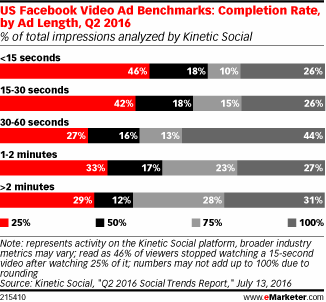
Kinetic Social, a data and technology marketing services solution provider, found that videos with lengths of 30-60 seconds have the highest completion rates. Further research highlighted that square videos are more effective than horizontal ones, as they take up more space in people's timelines. As the ad is for Facebook, these aspects informed the length and format of the video created.
As a starting point, I used the Drinkaware Visual Research made to inform my colour palette, typeface choice and illustration style. As feedback in the research stage highlighted that bright, high-contrast colours and fast transitions appeal to young people, I aimed to make the content of the ad short and concise. Feedback also suggested that the visual content is more important than aspects such as audio, therefore I attempted to make the ad work without the need of a voiceover. For this to work, fast text transitions and identifiable illustrations needed to be used.
I created a digital storyboard in Photoshop to organise the content of the ad before digitally animating in Adobe After Effects. I gained feedback from peers whilst making the ad to ensure that the transitions and time to read text were not too fast or short. Content and ilustrations were taken from The Drinkaware site and transitions were either made from scratch or presets. The overall animation process was very time consuming; however, as I have used After Effects a lot in the past, I was able to produce the desired outcome within a few days.
Once the animation was created I took certain parts and re-organised it into a poster. The main focus is to aware people in bars and clubs about their maximum recommended weekly drinking limit; therefore, to try and grab young people's attention I once again referred to the primary research made and used a bright pink background with contrasting white type and illustrations. To mock up the poster, photographs were taken of pub urinals and toilet doors.


No comments:
Post a Comment