
I received feedback from my tutor on the regulations and ad campaign outcomes made. Overall, feedback suggested that the outcomes are effective in response to the brief set - they would be easy to implement and would improve awareness regarding responsible alcohol use. The main point raised however was that the outcomes made are more suited to all ages than specifically young people. Whilst I did consider what appeals to young people, this was my aim in a sense, as alcohol awareness should not just be targeted at young people.
From the feedback it was suggested that I should make another outcome that ties in with the previous two produced, focusing purely on engaging young people. Feedback proposed that I make an app that is fun and game-focused. The aim of this was to try and engage young people and incorporate alcohol responsibility awareness as they play. This way, the focus is not just on alcohol responsibility - there is a challenging aspect that would keep young people interested.
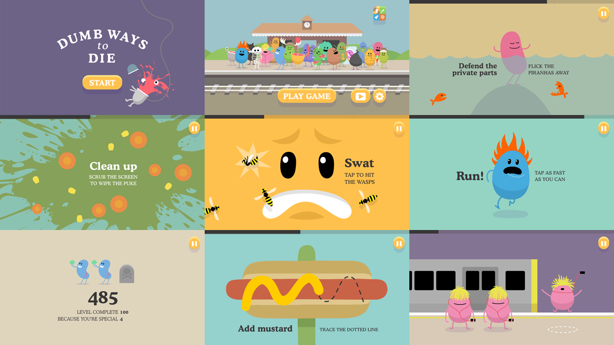
The Dumb Ways To Die app was highlighted as a source of inspiration to use. By analysing the app's style and gaining feedback from an ongoing crit of 18-21 year olds, a concept was made to produce a fast-paced app that combines mini games with information about drinking responsibly. The challenge was to try and teach people about responsible drinking whilst keeping the game as fun, challenging and fluid as possible. The main idea was to base mini-games on alcohol-related matters and have responsibility facts subtly in sync with how you do in the game. Winning a game would benefit your health; however, failing a mini game would result in negative health, being accompanied with an awareness message. Due to the fast nature of the game, the objective was to educate young people as they play through different mini-games, rather than giving them all the information in one go. To start the process, some sketches of mini-games were made with the input of the crit group.

After researching into UX design and other app-related areas, I began to digitally produce the app. 4 main mini-game mockups were made, all related to alcohol responsibility. Some are obvious whilst others are quite subtle to keep users engaged and intrigued to continue playing. As I was restricted with time, the mini-game animation examples produced are very simple; if the app was to be fully developed, the entire app would be far more intricate and interesting. The most important aspect, in my eyes, was to highlight the concept as clearly as possible.
The 4 main games are as follows:
12 Max
In this game, bottles move from right to left on a conveyor belt, gradually getting faster in speed. The objective is to stop the 12th alcopop bottle inside the centre square - linking to the weekly maximum drinking limit. This is done by tapping the screen. If users are above 12 bottles, they lose health. If they are below they get a boost in health, but this is higher the closer to 12 users are.

Memory Loss
This is a game where users must remember the cards and match them within a time frame. This is to subtly link with how alcohol can be associated with memory loss. Users receive a boost in health if they match 3 cards or above. Anything under that and they lose health.

Jump The Drunken Citizens
In this game, users must jump over drunken Drinkaware characters. This game aims to subtly highlight that drinking too much can have a negative effect on your health, linking to how hospital admissions due to alcohol have risen by 115% in the last 10 years. Jumping over 6/12 people and above will boost your health, whilst anything under that will reduce it.

In the last game, users must swipe a ball up or down to dodge two pint glasses. The arms extend at different speeds to make the game challenging. The aim of this game is to try and aware people that they should not let peer pressure be the deciding factor of their alcohol choices. This is to link in with the personal preference section in my dissertation. Health effects are the same as in the previous game.

For consistency with the other two outcomes, the same colour palette, typefaces and illustration styles were used. I also gained feedback from peers whilst making the game to ensure that transitions and time to read text were was optimum. By following the same method used when creating the video campaign, I made a digital storyboard in Photoshop before going on to animate in After Effects. The storyboard can be seen below.

As I am not experienced in coding, physically making the game was too difficult; therefore, I produced a mockup video of the potential user experience. This can be found on the submitted USB in the 'App' folder. As I was restricted with time, the mini-game animation examples produced are very simple; if the app was to be fully developed, the entire app would be far more intricate and interesting. The most important aspect, in my eyes, was to highlight the concept as clearly as possible. Distribution would be on Facebook, as a game, and also on mobile/tablet app stores for free.


I chose to name the app ‘DA Challenges’ in an attempt to attract young people into playing the app, as people suggested that people would make a judgement before choosing to play if it was obviously named about alcohol responsibility. This feedback was applied when making the app icon - illustrations are more memorable and intriguing than type, which is the reason for why Apple and other existing apps do not use type in their icons. As the game revolves around the health of the user's player, a character from the Drinkaware site was used as the icon's main focus. Feedback received can be read in the evaluation.
No comments:
Post a Comment