Friday, January 19, 2018

OUGD601 - Module Evaluation

This module has been very challenging; however, I have thoroughly enjoyed investigating into areas that interest me personally and areas that are not always associated directly with Graphic Design. Coming in to this year, I wanted to learn more about marketing, which is why I mainly focused my dissertation question on it. As I DJ in my free time, I have to constantly keep up with social media - particularly the advertising side of things. This requires a knowledge of constantly evolving marketing tools and strategies; therefore, being able to investigate into it in more depth has been great for improving my knowledge, not only in terms of my DJ work, but in terms of my practice as a whole.

Alongside marketing, I wanted to try and use this year to further enhance my motion graphics skills. Because I focused on social media, the chance to create some motion outcomes seemed like a great opportunity. I think that the practical side of the project taught me about how to be efficient with 2D motion graphics, as producing outcomes at a similar standard last year would have taken me much longer. Whilst I feel confident with 2D work, I aim to experiment with 3D more this year, so that I can include a variety of motion work in my portfolio.

Using the SmartSheet website to create a time plan is something that I have never done before; however, it made tracking deadline dates and upcoming tutorials much much easier. My time management in this module was very efficient because of it, therefore, I am going to use it in other modules this year to plan ahead and be as organised as possible. It has been a real challenge to come to terms with the independence factor of 3rd Year; however, after completing my dissertation and practical, I feel that I am now confident in handling, and organising, projects.

If I could have done anything differently in this project I would have liked to have worked with a coder to physically make the app. Animations and the workings could have been more intricate and fun if I did so; yet, due to the time I had available, it would have taken too long to produce the outcome. I am going to try and get in touch with Drinkaware and the ASA to see whether the work produced could be of interest to them. If they are interested, I will definitely look into possibilities of collaborating with a coder and illustrator.


OUGD601 - Project Synthesis


In my dissertation, I mainly conclude that social media marketing can be considered to have an effect on young people’s encouragement to consume alcohol; however, the issue of irresponsible drinking appears to be much more problematic, having more to do with how there is a lack of control over young people on social media sites as a whole than the marketing of alcohol brands online. With no effective restrictions on sites such as Facebook, where young people can lie about their age to gain access, alcohol brands and their content is realistically accessible to all.

After analysing the top 10 UK alcohol brands’ Facebook pages and posts, it became clear that there is no obvious awareness about drinking responsibly. The only aspect that was visible on half of the pages analysed was the ‘Drinkaware.co.uk for the facts’ type, placed in page cover photos; but, the point size used is small, easy to miss and requires users to go out of their way to search for the website outside of Facebook. It was argued in my essay that some brands, such as Heineken, do successfully promote responsible drinking through their online adverts; however, their social media pages and posts are lacking in relation.

By researching into a variety of areas, such as successful responsibility campaigns and the business and marketing tools already available to brands on social media platforms, it became clear that alcohol awareness and responsible drinking could be developed and promoted quite substantially. Due to the fact that Drinkaware’s website is extremely clear and easy to use, offering a huge range of information about alcohol in a concise, helpful manner, it seemed appropriate to use their existing content to develop a range of outcomes.

The first set of outcomes produced simply focus on introducing a variety of regulations that all online alcohol brands would have to abide by. The ASA has the ability to implement new regulations on alcohol brands; therefore, these outcomes highlight how implemented regulations would work, making the connection between the Drinkaware website and alcohol pages much stronger.

In terms of regulations, the three most suitable tools found from online research were custom chatbots, call-to-action buttons and page tabs. These tools are free to use and already accessible to brands, making the regulations fast to implement at no cost to the ASA, Drinkaware or alcohol brands. The main concept of using such tools is to make the user experience much more direct and accessible in terms of learning about alcohol and responsibility. If implemented on all alcohol brand pages, users would be able to start a conversation with brands to receive interactive information fed by Drinkaware’s chatbot; or, they could simply click the Drinkaware tab, which would bring all the information from the Drinkaware website into brand pages. The call-to-action regulations are more specific to advertising, whereby any brand-sponsored alcohol post would have a ‘Learn More’ button that takes users to the Drinkaware website. This ensures that even if posts are encouraging alcohol consumption, they are also promoting information about responsible drinking.

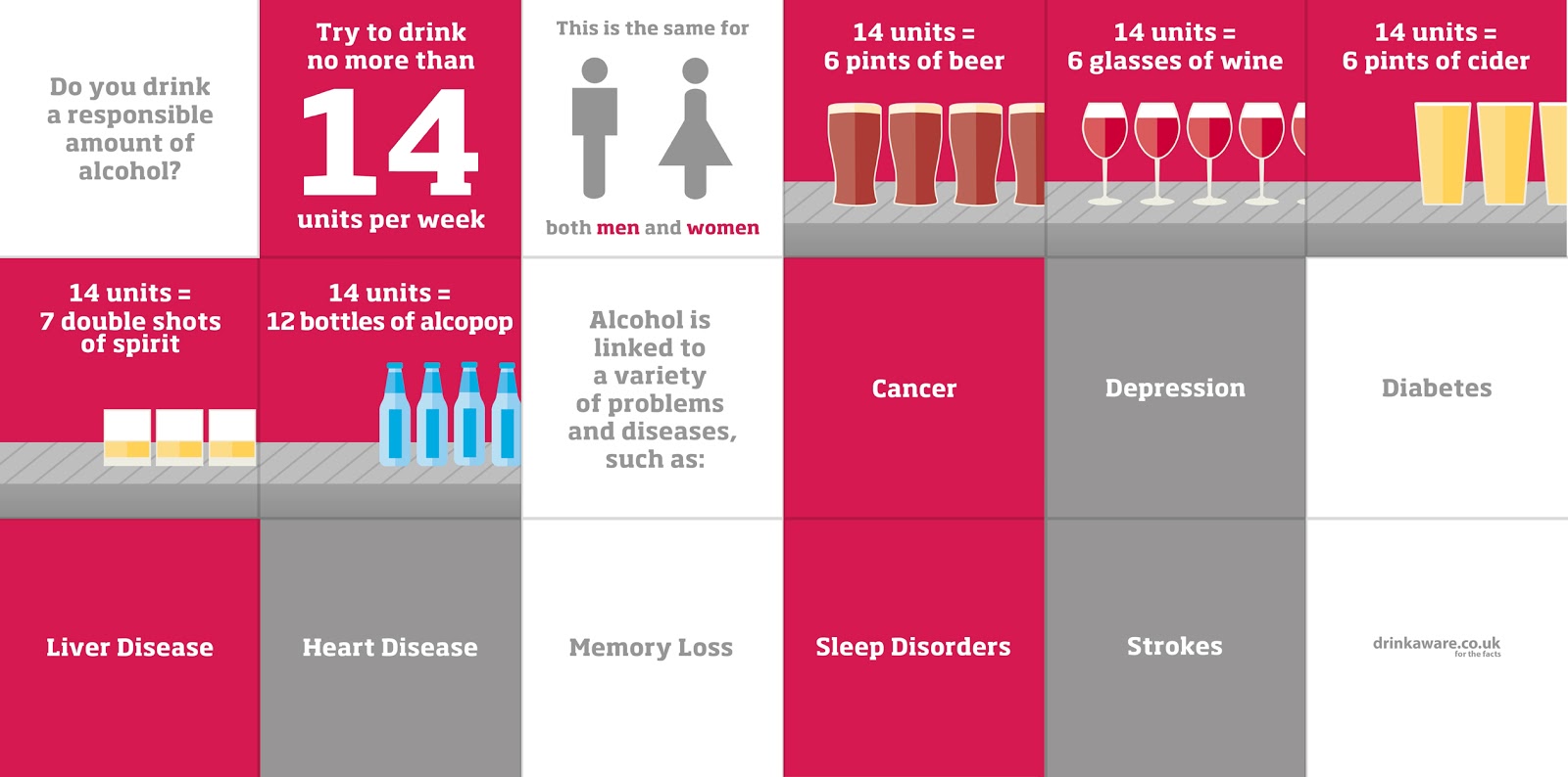
Alongside mocking up how the regulations would work and look, a second set of outcomes were produced. Informed by the discussion in Chapter 3 of my dissertation, it became clear that alcohol responsibility adverts tend to use two particular approaches - the use of role models or a rewarding quality. In an attempt to use an innovative, different approach, I made a concept to produce a purely factual, infographic campaign that visually awares people of their recommended weekly drinking limits and associated health effects of alcohol. Drinkaware have animated videos on YouTube that use a similar approach; however, they have yet to distribute any campaigns on sites such as Facebook.

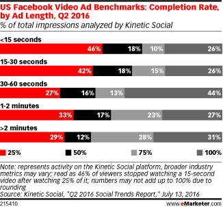
By considering a young audience, high-contrast colour changes and fast animations were used to try and grab users’ attention. The video length was kept between 30-60 seconds for optimum completion rates and the video was made to work without sound, as feedback highlighted that young people scroll through social media sites without having the sound of videos on. For consistency, colours, illustrations and typography were kept in line with Drinkaware’s style. The final animated video would be distributed and sponsored on all alcohol brand pages, as well as Drinkaware’s social media pages, to target younger people’s timelines.

To extend the campaign further, a poster was produced, which could be distributed in a range of places; pub, club and bar toilets were the most popular places suggested in feedback sessions as this is where people thought they would be most effective. The content was taken from the video ad to keep consistency throughout the campaign.

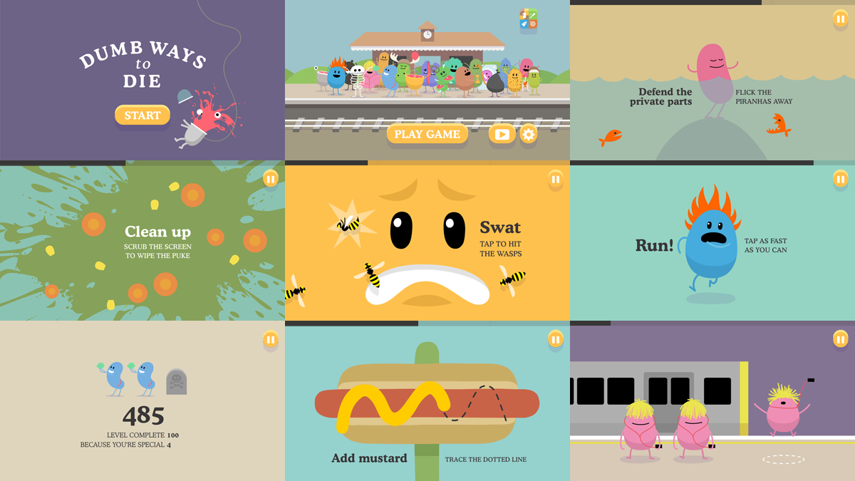
After producing these two sets of outcomes, I gained further feedback. It was suggested that I produce an app or game that more specifically engages young people, as comments highlighted that the outcomes produced so far would appeal to all ages. Taking inspiration from the Dumb Ways To Die app and feedback from an ongoing crit of 18-21 year olds, a concept was created to produce a fast-paced app that combines fun mini games with information about drinking responsibly. The challenge was to try and teach people about responsible drinking whilst keeping the game as challenging and fluid as possible. The main idea was to base mini-games on alcohol-related matters and have the responsibility facts subtly in sync with how you do in the game. Winning a game would benefit your health; however, failing a mini game would result in negative health and an accompanied awareness message. Due to the fast nature of the game, the objective was to educate young people as they play through different mini-games, rather than giving them all the information in one go.

Naming the app ‘DA Challenges’ an attempt to make young people play the app, as people suggested that people would make a judgement before choosing to play if it was obviously named about alcohol responsibility. As it would be promoted and distributed by Drinkaware, colours, illustrations and typography were once again kept in line with their graphic style for consistency. As I was restricted with time, the mini-game animation examples produced are very simple; if the app was to be fully developed, the entire app would be far more intricate and interesting. The most important aspect, in my eyes, was to highlight the concept as clearly as possible. Distribution would be on Facebook, as a game, and also on mobile/tablet app stores for free download.

All the outcomes discussed can be found on the USB in my submission folder.

Thursday, January 18, 2018

OUGD601 - Practical - Questionnaire & Evaluation


After producing the various outcomes I wanted to receive some summative feedback on them to see whether people thought I had successfully answered the brief made. To do so, I made a survey and asked a variety of young people to send it to their friends. I managed to receive 43 responses from a variety of age groups - 16% were aged 13-17, 77% were aged 18-25 and 7% were aged over 25.

Overall, the feedback was very positive; over 90% of people thought that the outcomes would be easy to implement and effective in promoting responsible drinking. The set of regulation outcomes received the best feedback, with 100% of people believing that the regulations would be an effective way of giving users access to Drinkaware content within Facebook. Interestingly, 30% of people didn't think that the proposed regulations are necessary - the majority of those who chose 'other' said that they aren't necessary, but would definitely increase awareness of alcohol responsibility.

In terms of the ad campaign and poster, 3/4 of people said that the design would grab their attention. Feedback from those who chose 'other' said that it is hard to tell if it would grab their attention when not displayed on their Facebook timelines. Experiments on people's timelines could be one effective way of judging the video's effectiveness.

One really useful piece of constructive feedback received highlighted that I could have more illustrations in the ad, particularly at the end where the health effects are listed in type. I did consider this; however, I found it difficult to make illustrations for certain health effects, such as cancer. This is one aspect that would need to be carefully considered if the ad was developed further.

Another piece of constructive feedback that was interesting to hear was that I could focus on different social media platforms, such as Instagram and Twitter. Due to the fact that alcohol brands invest the most amount of money into Facebook, I kept my outcomes focused on it; but, if the outcomes were to be taken forward and implemented, other social media platforms would definitely be considered - especially in terms of the regulations.

The feedback for the game was very informative. Over 90% of people thought that the concept of combining mini games with alcohol responsibility is more engaging for younger audiences; however, 35% of people said that they wouldn't play the game. By reading the 'other' responses and overall development suggestions, it is clear that the game would need to be improved a lot. Some of the improvements suggested include adding sound effects and introducing different levels/incentives and leaderboards for competitivity. If I had more time to develop the app and work with a coder I would add such options to improve the user experience and overall fun-factor. By doing so, it appears from the feedback that people would be more interested in playing, and for longer periods of time. To fully judge this, further surveys would need to be made, as 3/4 of the people who completed this survey were aged 18-25.

In conclusion, I think that the outcomes successfully answer the constructed brief. Whilst the app needs a lot of development, the feedback suggests that all the outcomes are effective in being easy to implement, effective in promoting responsibility and clearly associated with Drinkaware. In relation to my dissertation, I feel that the practical outcome strongly links to my argument that tighter restrictions on social media platforms could have a positive effect on awaring people of responsible alcohol use and consumption. The time plan made at the start of this module was extremely helpful as it allowed me to produce outcomes to the best ability I could. As marketing and motion graphics are both areas that interest me, this practical project was extremely enjoyable and beneficial for my portfolio. I am going to try and get in touch with Drinkaware and the ASA to see whether the work produced could be of interest to them. All the digital outcomes produced can be found on the submitted USB; however, they can also be found on my blog.


Wednesday, January 17, 2018

OUGD601 - Practical - Final Outcomes


DA Challenges App:


Drinkaware Campaign:

Awareness Ad


Awareness Poster


ASA x Drinkaware Regulations: 

Chatbots


CTAs


Custom Tabs


Sunday, January 14, 2018

OUGD601 - Practical - Feedback & App Development


I received feedback from my tutor on the regulations and ad campaign outcomes made. Overall, feedback suggested that the outcomes are effective in response to the brief set - they would be easy to implement and would improve awareness regarding responsible alcohol use. The main point raised however was that the outcomes made are more suited to all ages than specifically young people. Whilst I did consider what appeals to young people, this was my aim in a sense, as alcohol awareness should not just be targeted at young people.

From the feedback it was suggested that I should make another outcome that ties in with the previous two produced, focusing purely on engaging young people. Feedback proposed that I make an app that is fun and game-focused. The aim of this was to try and engage young people and incorporate alcohol responsibility awareness as they play. This way, the focus is not just on alcohol responsibility - there is a challenging aspect that would keep young people interested.


The Dumb Ways To Die app was highlighted as a source of inspiration to use. By analysing the app's style and gaining feedback from an ongoing crit of 18-21 year olds, a concept was made to produce a fast-paced app that combines mini games with information about drinking responsibly. The challenge was to try and teach people about responsible drinking whilst keeping the game as fun, challenging and fluid as possible. The main idea was to base mini-games on alcohol-related matters and have responsibility facts subtly in sync with how you do in the game. Winning a game would benefit your health; however, failing a mini game would result in negative health, being accompanied with an awareness message. Due to the fast nature of the game, the objective was to educate young people as they play through different mini-games, rather than giving them all the information in one go. To start the process, some sketches of mini-games were made with the input of the crit group.


After researching into UX design and other app-related areas, I began to digitally produce the app. 4 main mini-game mockups were made, all related to alcohol responsibility. Some are obvious whilst others are quite subtle to keep users engaged and intrigued to continue playing. As I was restricted with time, the mini-game animation examples produced are very simple; if the app was to be fully developed, the entire app would be far more intricate and interesting. The most important aspect, in my eyes, was to highlight the concept as clearly as possible.

The 4 main games are as follows:

12 Max

In this game, bottles move from right to left on a conveyor belt, gradually getting faster in speed. The objective is to stop the 12th alcopop bottle inside the centre square - linking to the weekly maximum drinking limit. This is done by tapping the screen. If users are above 12 bottles, they lose health. If they are below they get a boost in health, but this is higher the closer to 12 users are.


Memory Loss

This is a game where users must remember the cards and match them within a time frame. This is to subtly link with how alcohol can be associated with memory loss. Users receive a boost in health if they match 3 cards or above. Anything under that and they lose health.


Jump The Drunken Citizens

In this game, users must jump over drunken Drinkaware characters. This game aims to subtly highlight that drinking too much can have a negative effect on your health, linking to how hospital admissions due to alcohol have risen by 115% in the last 10 years. Jumping over 6/12 people and above will boost your health, whilst anything under that will reduce it.

Dodge Those Pesky Pints

In the last game, users must swipe a ball up or down to dodge two pint glasses. The arms extend at different speeds to make the game challenging. The aim of this game is to try and aware people that they should not let peer pressure be the deciding factor of their alcohol choices. This is to link in with the personal preference section in my dissertation. Health effects are the same as in the previous game.


For consistency with the other two outcomes, the same colour palette, typefaces and illustration styles were used. I also gained feedback from peers whilst making the game to ensure that transitions and time to read text were was optimum. By following the same method used when creating the video campaign, I made a digital storyboard in Photoshop before going on to animate in After Effects. The storyboard can be seen below.


As I am not experienced in coding, physically making the game was too difficult; therefore, I produced a mockup video of the potential user experience. This can be found on the submitted USB in the 'App' folder. As I was restricted with time, the mini-game animation examples produced are very simple; if the app was to be fully developed, the entire app would be far more intricate and interesting. The most important aspect, in my eyes, was to highlight the concept as clearly as possible. Distribution would be on Facebook, as a game, and also on mobile/tablet app stores for free.


I chose to name the app ‘DA Challenges’ in an attempt to attract young people into playing the app, as people suggested that people would make a judgement before choosing to play if it was obviously named about alcohol responsibility. This feedback was applied when making the app icon - illustrations are more memorable and intriguing than type, which is the reason for why Apple and other existing apps do not use type in their icons. As the game revolves around the health of the user's player, a character from the Drinkaware site was used as the icon's main focus. Feedback received can be read in the evaluation.


Wednesday, January 10, 2018

OUGD601 - Practical - UX & App Design Research


To inform the app outcome I needed to research into guidelines and useful information when designing for mobile devices. Apple sum up some very useful points that informed some of my design choices:
  • Formatting Content - Create a layout that fits the screen of an iOS device. Users should see primary content without zooming or scrolling horizontally.
  • Touch Control - Use UI elements that are designed for touch gestures to make interaction with your app feel easy and natural.
  • Hit Targets - Create controls that measure at least 44 points x 44 points so they can be accurately tapped with a finger.
  • Text Size - Text should be at least 11 points so it's legible at a typical viewing distance without zooming.
  • Contrast - Make sure there is ample contrast between the font color and the background so text is legible.
  • Spacing - Don't let text overlap. Improve legibility by increasing line height or letter spacing.
  • High Resolution - Provide high-resolution versions of all image assets. Images that are not @2x and @3x will appear blurry on the Retina display.
  • Distortion - Always display images at their intended aspect ratio to avoid distortion.

In terms of icons, an IOS template was used. For other devices, further research would need to be made.


Wednesday, January 3, 2018

OUGD601 - Practical - Digital Development: Campaign


The second idea that was digitally developed forward was the Drinkaware Campaign. The task for this idea was to create a responsibility video advert that highlights the maximum recommended weekly drinking limit and health effects of alcohol. It was important to use the resarch made into what appeals to a young audience to make the video grab young people's attention. Also, it was encouraged from feedback that I make a poster that accompanies the video campaign, being distributed in bar and pub toilets.

Kinetic Social, a data and technology marketing services solution provider, found that videos with lengths of 30-60 seconds have the highest completion rates. Further research highlighted that square videos are more effective than horizontal ones, as they take up more space in people's timelines. As the ad is for Facebook, these aspects informed the length and format of the video created.

As a starting point, I used the Drinkaware Visual Research made to inform my colour palette, typeface choice and illustration style. As feedback in the research stage highlighted that bright, high-contrast colours and fast transitions appeal to young people, I aimed to make the content of the ad short and concise. Feedback also suggested that the visual content is more important than aspects such as audio, therefore I attempted to make the ad work without the need of a voiceover. For this to work, fast text transitions and identifiable illustrations needed to be used.


I created a digital storyboard in Photoshop to organise the content of the ad before digitally animating in Adobe After Effects. I gained feedback from peers whilst making the ad to ensure that the transitions and time to read text were not too fast or short. Content and ilustrations were taken from The Drinkaware site and transitions were either made from scratch or presets. The overall animation process was very time consuming; however, as I have used After Effects a lot in the past, I was able to produce the desired outcome within a few days.


Once the animation was created I took certain parts and re-organised it into a poster. The main focus is to aware people in bars and clubs about their maximum recommended weekly drinking limit; therefore, to try and grab young people's attention I once again referred to the primary research made and used a bright pink background with contrasting white type and illustrations. To mock up the poster, photographs were taken of pub urinals and toilet doors.